 Doc
Doc
Tailwind CSS によるダークモード実装ガイドのスライド by @snappify_io snappify.com/view/8d426d44-…
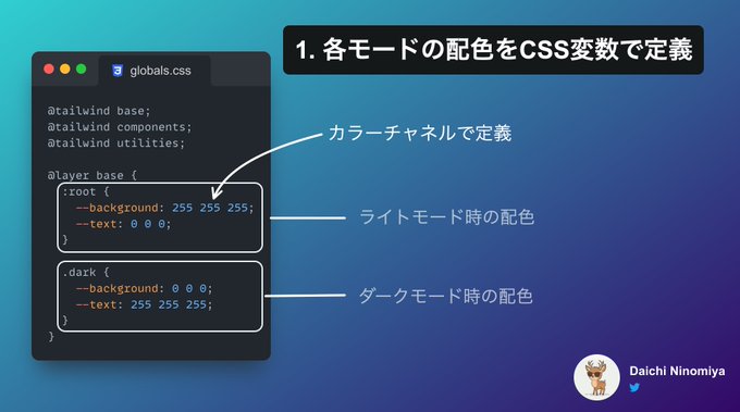
CSS 変数を使ってライトモード、ダークモードの色を定義する。
:root {
  --background: 0 0% 100%;
  --foreground: 222.2 47.4% 11.2%;
  /* ... */
}

.dark {
  --background: 0 0% 100%;
  --foreground: 222.2 47.4% 11.2%;
  /* ... */
}:root {
--background: 0 0% 100%;
--foreground: 222.2 47.4% 11.2%;
/* ... */
}
.dark {
--background: 0 0% 100%;
--foreground: 222.2 47.4% 11.2%;
/* ... */
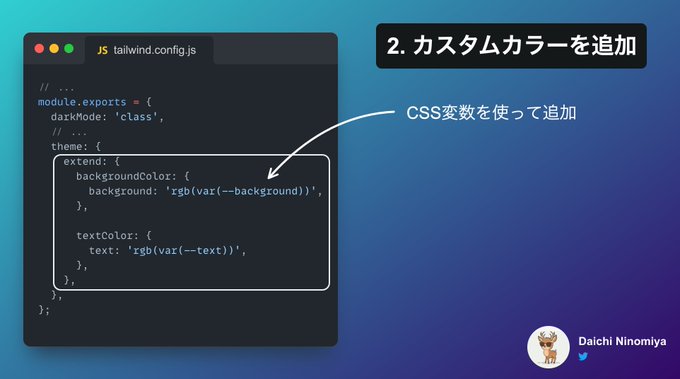
}定義した色を Tailwind CSS に登録する。ついでに dakMode: ['class'] を設定する。
/** @type {import('tailwindcss').Config} */
module.exports = {
  darkMode: ['class'],
  // ...
  theme: {
    // ...
    extend: {
      colors: {
        background: 'hsl(var(--background))',
        foreground: 'hsl(var(--foreground))',
        // ...
      },
    },
  },
  // ...
};/** @type {import('tailwindcss').Config} */
module.exports = {
darkMode: ['class'],
// ...
theme: {
// ...
extend: {
colors: {
background: 'hsl(var(--background))',
foreground: 'hsl(var(--foreground))',
// ...
},
},
},
// ...
};定義が大変なので shadcn/ui で CSS 変数定義&Tailwind CSS 登録をまとめて行った上で適宜調整するアプローチを推奨。以下のコマンドでまとめて自動設定可能。
pnpm dlx shadcn-ui initpnpm dlx shadcn-ui initnext-themesを利用。
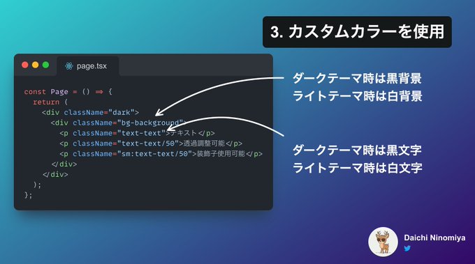
pnpm add next-themespnpm add next-themes導入は公式ドキュメントのガイドに従って Provider の作成と Layout へのセットを行う。App Router を使用する場合、このガイドに従わないと正しく動作しないので注意。
カラーモード切り替えボタンはクライアントコンポーネントかつ、ブラウザロード後にレンダリングしないとエラーが出るなどトラップが多い。公式ドキュメントに沿って、以下のように実装する。
'use client';

import { useState, useEffect } from 'react';
import { useTheme } from 'next-themes';

function ThemeSwitch() {
  const [mounted, setMounted] = useState(false);
  const { theme, setTheme } = useTheme();

  // useEffect only runs on the client, so now we can safely show the UI
  useEffect(() => {
    setMounted(true);
  }, []);

  if (!mounted) {
    return null;
  }

  return (
    <select value={theme} onChange={(e) => setTheme(e.target.value)}>
      <option value="system">System</option>
      <option value="dark">Dark</option>
      <option value="light">Light</option>
    </select>
  );
}

export default ThemeSwitch;
'use client';
import { useState, useEffect } from 'react';
import { useTheme } from 'next-themes';
function ThemeSwitch() {
const [mounted, setMounted] = useState(false);
const { theme, setTheme } = useTheme();
// useEffect only runs on the client, so now we can safely show the UI
useEffect(() => {
setMounted(true);
}, []);
if (!mounted) {
return null;
}
return (
<select value={theme} onChange={(e) => setTheme(e.target.value)}>
<option value="system">System</option>
<option value="dark">Dark</option>
<option value="light">Light</option>
</select>
);
}
export default ThemeSwitch;Tailwind CSS によるダークモード実装ガイドのスライド by @snappify_io snappify.com/view/8d426d44-…